
Typography: The Silent Storyteller Behind Iconic Brands
By Michelle Spivey
Creative Director, Digital Serif
Typography isn’t just design — it’s communication distilled into form. It’s how a brand sounds before it ever speaks. In two decades of building identities and campaigns, I’ve seen typography single-handedly define perception, turning ordinary messaging into emotional connection.
The right typeface doesn’t just decorate language; it embodies it. It can convey heritage, rebellion, luxury, or simplicity — all before the audience reads a single word. In branding, typography is more than a stylistic choice; it’s a strategic one.
Here’s how some of the world’s strongest brands have turned type into storytelling:

Apple — The Language of Clarity
Agency: TBWA\Media Arts Lab
Apple’s custom sans-serif, San Francisco, mirrors the brand’s design philosophy: clean, human, and intuitive. Its typography is deliberate minimalism — a reflection of clarity and innovation. The words never shout; they simply shine.

The New York Times — Gravitas in Every Letter
Agency: Wolff Olins (brand refinement)
The Times’ iconic Gothic Blackletter masthead projects integrity and trust, anchoring modern headlines in tradition. By pairing heritage type with digital-friendly sans-serifs, the brand bridges legacy and progress — a visual metaphor for journalism that evolves without compromise.
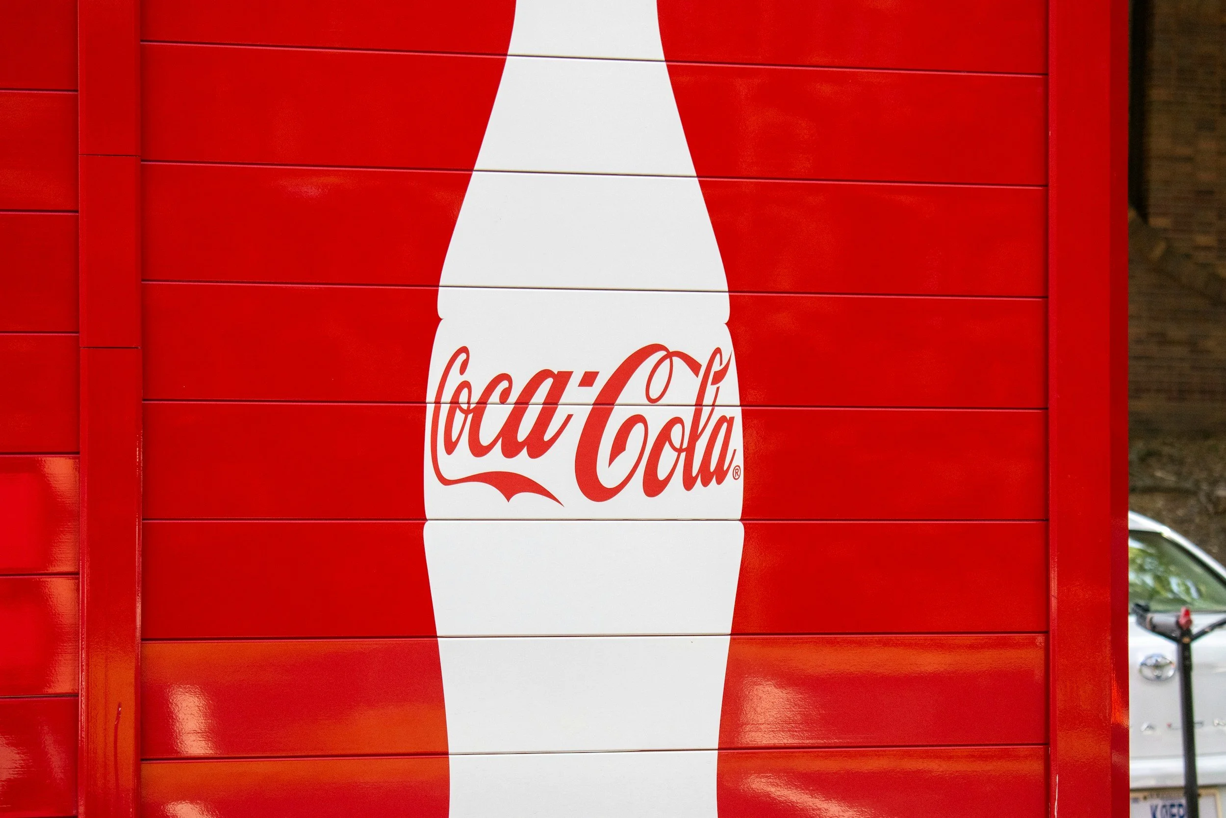
Coca-Cola — Emotion in Script Form
Agency: D’Arcy Advertising
That flowing Spencerian script doesn’t just spell a name — it stirs nostalgia. Coca-Cola’s typography embodies joy, warmth, and connection. It’s not a logo; it’s a memory.

Nike — Motion in Minimalism
Agency: Wieden+Kennedy
Nike’s typographic language is bold, direct, and in perpetual motion. The clean geometry of Futura and Trade Gothic captures speed and confidence. Each headline feels like it’s sprinting off the page — the visual equivalent of Just Do It.

Dr. Martens — Rebellion in Block Letters
Agency: Made Thought
Dr. Martens’ industrial sans-serifs feel unapologetically raw. It’s typography that refuses polish — a perfect reflection of the brand’s defiant, individualist spirit. It doesn’t conform; it confronts.

Dior Beauty — Whispered Luxury
Agency: Baron & Baron
The Didot serif is elegance personified. Its thin strokes and refined contrasts evoke couture craftsmanship. Dior’s typography doesn’t demand attention — it earns it through poise and precision.
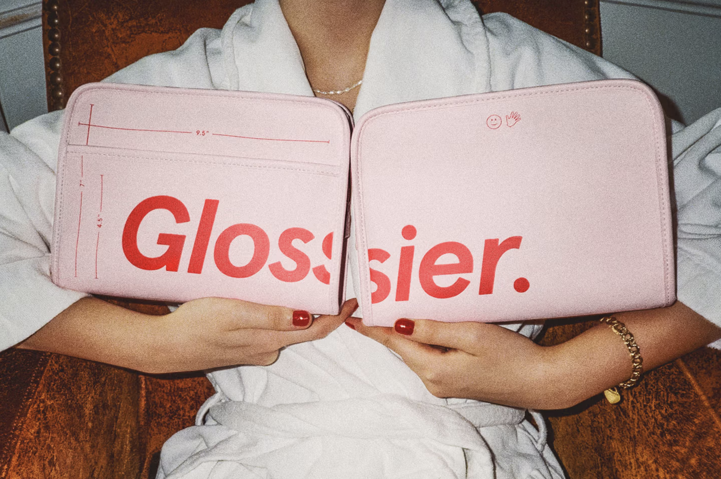
Glossier — Modern Beauty in Lowercase
Agency: Gin Lane
Glossier flipped beauty branding on its head with approachable lowercase type and rounded sans-serifs. The tone is fresh, human, and authentic — a mirror of the brand’s inclusive, conversational ethos.
The Takeaway: Type is Voice
Typography is a brand’s first impression — and often its most lasting one. It shapes trust, emotion, and recognition at a glance. When it’s chosen with intention, type becomes invisible not because it’s unnoticed, but because it feels inevitable.
In a world saturated with content, the way your brand speaks visually is as important as what it says.
💬 Is your brand speaking in the right visual voice?
At Digital Serif, we help brands define, refine, and express their identity through design that connects — emotionally, strategically, and authentically.
📩 Let’s talk about your brand’s voice, story, and future.
👉 Contact Us
#Brand Identity #Typography #Creative Direction #Brand Strategy #Design Leadership #Visual Storytelling #BrandVoice #Digital Branding Strategy #Online Brand Presence